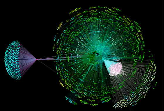
Identifying trends and patterns can be a difficult process when viewing data as a chart or spreadsheet. But easily identifying the deficiencies of a website’s internal linking structure can be even more difficult. Data visualizations help us gain insights on these deficiencies. With it, we can further analyze outliers and clusters of information, visually. Furthermore, we can also see the collective life of a website and all of it’s complexities.

Exploring the Narrative
What information can be gleaned from these images?
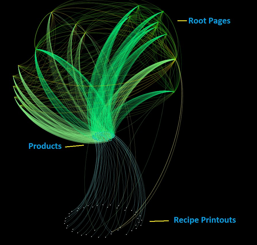
Data point distribution allows us to make inferences on a site’s direction. Because seeing how the data points are clustered, tells us if a site is going in the right direction. For example, data points in a “central node” position, meaning highly connected, show up in a “crossroads” of one or several regions of the graph. This is good because these data points are the gateways to information, which directs user flow. And the more connected these gateways are, the better the user flow is.
Similarly, data points that show up between two important and separated regions of the graph act as bridges connecting two or more clusters. Sometimes serving as the point of passage between them. This could be ideal or problematic, depending on the types of pages. So, data visualization can help you identify if the right types of pages have the right type of connectivity.
Below is a visualization from an SEO tool called ScreamingFrog. ScreamingFrog is not only a website crawler that pulls information, but also a tool that lets you capture the global distribution of connectivity. A key sign of a good website network is a balanced connectivity. And being cognizant of the balances and imbalances expressed in a network, allows you to drill down on specific areas of improvement.
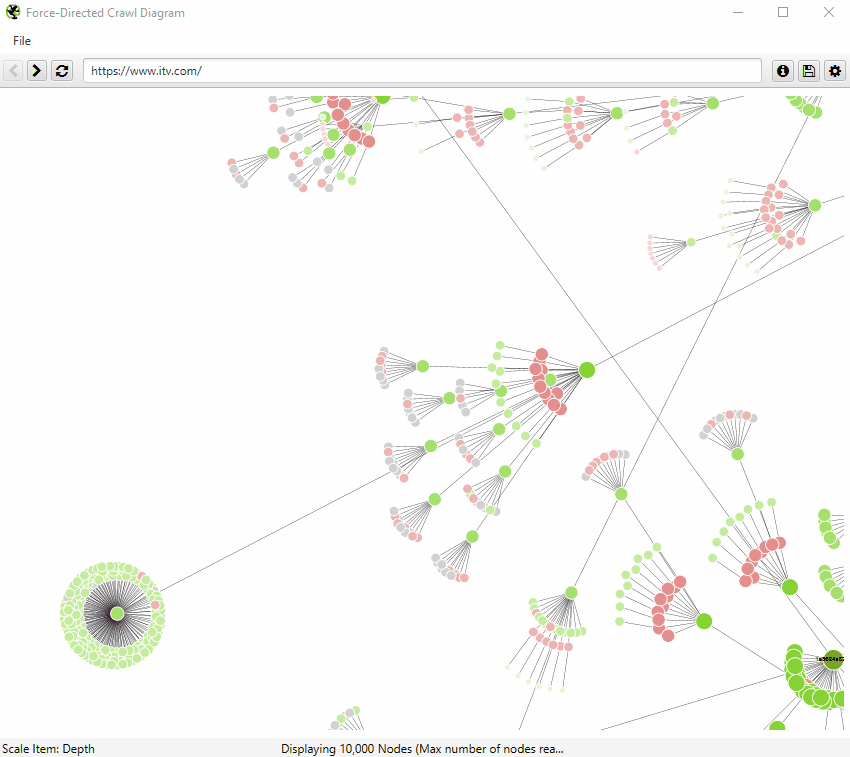

Structure Analysis
Have you ever been shocked to discover hidden sections of a website that was linked poorly? Structure analysis lets you easily identify parts of the website or page types that are linked poorly or extensively.
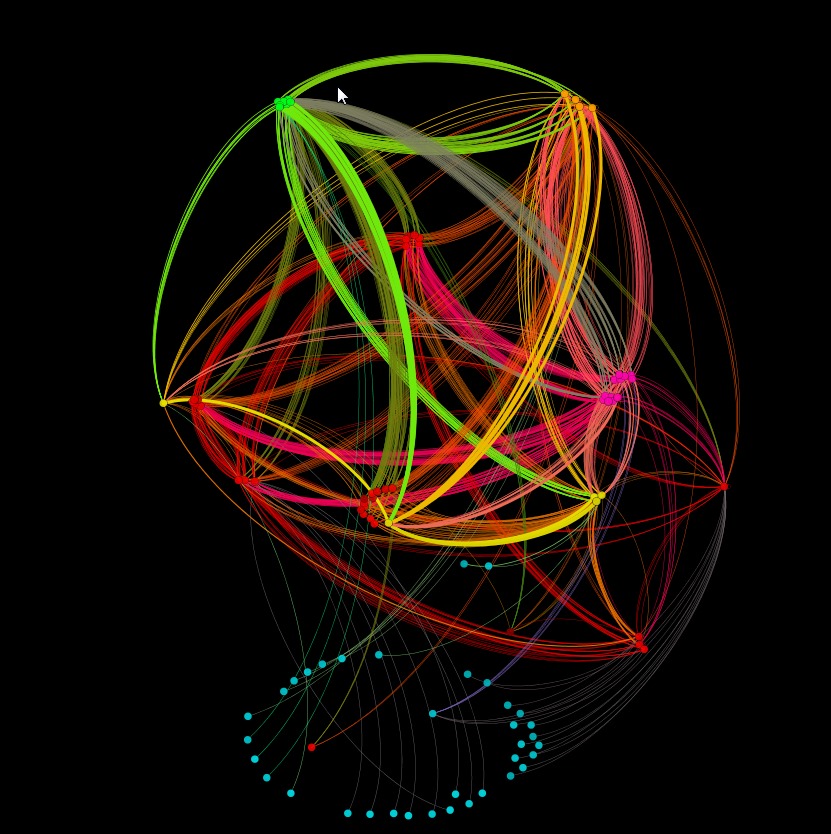

What can the overall layout and shape of the network tell us?
We can look at these layouts both in terms of the neighborhoods around data points and routes to other regions of the map. Details that emerge through this network, allows us to see the ultimate story by the various elements, clusters, and connections.
For example, the network layout and shape can measure how easy it is to visit all the pages of a website. Because the only way to visit a page, is to follow a link. If the link-path to a page from the homepage is convoluted, or if there are no alternative routes to that page, the page may be rarely picked up by Search Engines, if at all. And if that page is one that you want to drive traffic to your site, this could be a problem. Thus, data visualization graphs are helpful because they can help you easily identify convoluted link-paths.


Closing
Data visualization provides a structure that’s designed to present and explore the relationships between data points. While the graphs are truly beautiful, and tweaking the parameters feels almost like art, this isn’t about creating beautiful images, but obtaining important data about site structures.